 A big thank you to historical novelist and historian Toni Mount for joining us today with a guest article.
This is a stop on her blog tour celebrating the launch of her latest Seb Foxley medieval murder mystery.
I had access to an advance reader copy and I have to say that it’s my favourite in the series so far. Congratulations to Toni!
Order now at http://getbook.at/colour_of_evil.
Over to Toni…
In Seb Foxley’s latest medieval murder mystery, The Colour of Evil, our hero is working on a lavish book for King Edward and fearing he might not recoup the high cost of the beautifully illuminated work, so why was illumination so expensive?
For a start, the making of a luxurious presentation piece, as required in this instance, was extremely labour-intensive, involving maybe hundreds of skilled man-hours. Secondly, the materials required didn’t come cheap: the best calf-skin vellum, the gold and the pigments.
But for Seb, as a skilled artist, there was scope for creativity in the illuminated miniatures more so than for the scribe of whom neatness and accuracy in the copying were the important factors. Incidentally, ‘miniatures’ could be full-page pictures, not just small illustrations. The word derives from the Latin minium meaning the red lead pigment first used to highlight important initial letters; it doesn’t refer to the size of the illustration until the Elizabethan miniaturists, like Nicholas Hillyard came along, creating their miniscule portraits.
Once the text was written, if gold or silver were going to be used in the illumination, they were put on first before any colour. This meant the pictures and decoration had to be drawn in, so the illuminator knew precisely where to put a halo or the shape of the background to be covered in gold. For fine detail, like scroll-work, powdered gold, known as ‘shell-gold, was mixed with gum arabic to make golden glue which was applied with a pen – avoiding ruining a brush with glue. For backgrounds and haloes etc. the gold leaf was applied onto gesso (or ‘just-so’, as Joan Alder calls it) – plaster of paris – to make a raised area with the 3D effect of a golden cushion. When the gesso had dried out, gold was applied, the artist breathing on the plaster was enough to stick the leaf. The surface was then polished, often with a dog’s tooth, a process which made it shine and neatened the edges. Any leftover flakes of gold leaf or ‘lemel’ were collected up and saved for next time, if large enough, or made into shell-gold, as Seb instructs his apprentice, Kate.
Now the illumination was ready to have the colours applied, using pen and/or brush. Sometimes the pigment to be used was already decided at the design stage, indicated by symbols on the drawing with areas marked as ‘V’ for vermilion or ‘M’ for malachite green or D-O for dark ochre, just as Seb does in The Colour of Evil. Did you think painting-by-numbers was a modern idea? This artists’ code also provides Seb with a clue to his mystery.
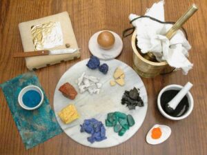
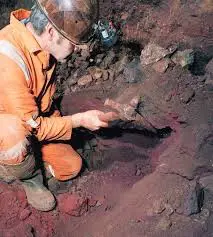
There was quite a wide choice of pigments available to medieval artists. Ochres were good and inexpensive pigments, used since the Stone Age. These iron oxide ores came in a wide range of colours, from creamy yellows to dark browns, russets to blood red and orange. Ochres were – and still are – mined in the Forest of Dean, Gloucestershire, in England where a pink shade, rose ochre, is also found and highly prized. Something called green earth or terre-verte a non-ferous ore, was also available. Along with white chalk and black charcoal, these had provided the artists’ palette for millennia.
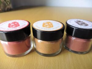
By Seb’s era, more expensive pigments were available, their use often stipulated in the contract. Luxurious colours were more worthy of God’s word or to impress the recipient, if the book was intended for a person of importance, as in this case, the king’s gift to the de’ Medici in Florence. Red was the colour most used, especially for initials and marking ‘red-letter days’ on calendars. The cheapest pigment was red lead but there were other shades. Orange (then called tawny), pink (then known as rose) and crimson hues could all be obtained at reasonable cost from the madder plant which was also used as a textile dye.
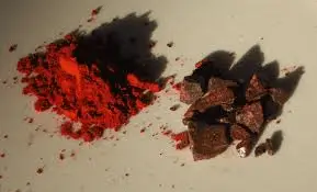
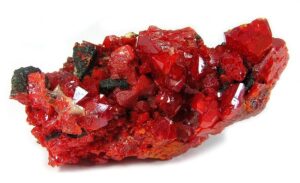
The exotic ‘dragon’s blood’ which – according to the pigment-sellers (to get a higher price?) was the mixed blood of dragons and elephants spilt during the creatures’ regular battles – is another plant dye from the Pterocarpus draco bush; or the more expensive red: vermilion. Vermilion was tricky stuff for all who handled it since it was obtained from cinnabar: mercuric sulphide, which is toxic. The Italian artist, Cennino Cennini, who wrote a treatise on his craft, said of vermilion:
If you want to take the trouble, you will find plenty of receipts [recipes] for it [vermilion], and especially by asking the friars. But I advise you rather to get some of that which you find at the apothecaries’ [druggists] for your money, so as not to lose time in the many variations of procedure.
Cennini also warned the artist not to buy vermilion ready ground because the powdered form was easily adulterated with cheap red lead or even brick dust. Although vermilion produced a lovely vivid scarlet colour, it had a nasty habit of reacting with other chemical pigments nearby on the page, turning black over time, sometimes for no apparent reason, but especially with red or white lead, the latter being used often as an undercoat to produce paler shades.
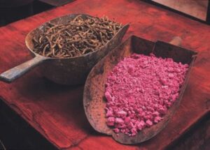
Incidentally, this use of undercoats or glazes over pigments was how the medieval artist made his colours lighter or darker for highlights and shadows: pigments were hardly ever mixed together before being applied. The reason for this was that pigments were created by God and to mix them was not only to attempt to usurp His authority by trying to create your own hue but also adulterated the colours God had intended. It also avoided the too frequent outcome of mixing impure colours: achieving nothing but a grubby brown result and wasting pigment.
Most expensive of all reds was crimson, made from the minute dried kermes insects from areas around the Black Sea, every one of which had to be hand-picked off its host plant. This pigment gave a rich, warm red, similar to the pigment cochineal – kermes’ American cousin discovered in the sixteenth century – and was often used for the robes of the most important figures in a picture, such as Christ or the Virgin Mary (red was her colour as well as blue which became the more dominant of the two).
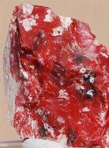
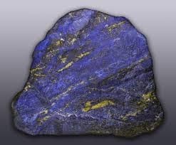
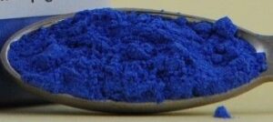
Blue pigments were produced from azurite, a copper mineral found in Derbyshire; from the seeds of the turnsole plant (also used as a medieval food colouring); or the most luxurious ‘heavenly’ blue: lapis lazuli, known as ‘ultramarine’ because it came from lands ‘beyond the sea’. At the time, there was only one source of ultramarine: Afghanistan, though there are other sources today, including Argentina, California and Siberia. In the thirteenth century, Marco Polo wrote about seeing the mines in Afghanistan, but ultramine was used at least six hundred years earlier in the exquisite Lindisfarne Gospels and had been used in Persia centuries before that. Lapis lazuli not only had to travel from afar but its preparation was intricate, in order to get the best blue, worthy of the Virgin Mary’s robe, because the stone contained other minerals too: calcite which is white and iron pyrites or ‘fools’ gold’ which sparkles like gold but can also turn black. Straightforward grinding of lapis produced a grey powder, hardly blue at all. Achieving the gorgeous colour required involved mixing it by kneading it together with powdered pine resin, mastic and new wax (according to Cennini’s method) to make a ‘plastic’ as he calls it. This is then washed in lye [a harsh soap and water] for a few days to extract the blue pigment, leaving the impurities behind in the ‘plastic’. Cennini had thoughts on who was best at this lengthy task:
Know too that making it is an occupation for pretty girls rather than for men, for they are always at home, and reliable, and they have more dainty hands.
Just beware of old women.[!]
Green pigments were made from malachite (another copper mineral available from Derbyshire) or from verdigris which was simply made by suspending a piece of copper in vinegar fumes – try putting a piece of copper piping in a coffee jar with a dash of vinegar in the bottom. In a few days you can scrape the green crystals off the piping but these are poisonous, so wash your hands after.
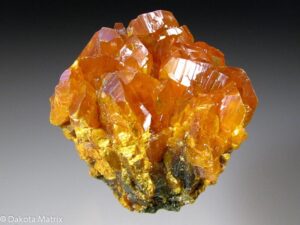
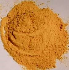
Some high quality yellow pigments came from saffron (very expensive) or orpiment (also very costly) and Cennino was not enthusiastic about using it, knowing it was lethally poisonous and reacted with all the copper-based pigments. It is the compound arsenic trisulphide. Despite these drawbacks, orpiment is a gorgeous golden yellow which often contains particles of mica which make it sparkle, so it was sometimes used instead of gold. A vivid orange pigment was realgar, close cousin to orpiment and only a fraction less poisonous but for some reason this was hardly used compared with orpiment.
White lead was the best white and quite cheap, though also toxic with long exposure. Bone white was, literally, made by burning bones to ash in a fire, though Cennini recommends the bones of wild birds and poultry. The ash was then finely ground. If mixed with rabbit-skin glue, it made a good primary coat for paper intended to be drawn upon with a silverpoint.
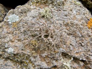
Purple was a difficult colour to produce as a pigment for painting. Folium or orchil, a lichen, produced a good purple dye of reasonable price and some illuminators and artists did use it in their work.
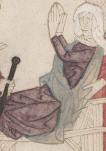
More often, purple was the one exception to the ‘no mixing of colours’ rule but was rarely used as a main field of colour, but rather to make the shadows in the folds of garments.
To turn these powdered pigments into useable paint that would hold onto the parchment, they were mixed with egg yolk or egg white to create egg tempura. The yolk would be separated from the the white and the outer membrane pierced to release the yellow liquid content which was then mixed with the pigment. Egg ‘glare’, the liquid left at the bottom of the bowl when the whites are lightly beaten, was preferred for mixing the blues as the yellow yolk gave them a greenish tinge. In either case, egg tempera produced a quick-drying pigment with a glossy finish that could last for centuries. If you want to try making egg tempera, here is a link to a site that you may find helpful – https://tinkerlab.com/make-your-own-egg-tempera-paint/
An alternative to egg was animal glue, known as size, made by boiling up bones and skin or even parchment trimmings.
The illuminator would have bought his ingredients from an apothecary or maybe a grocer and then made up the paints for his own use – a skill that was highly prized and, apart from the likes of our friend Cennini, kept as the secrets of the craft, to be passed on from master to apprentice down the centuries. Finally, the illuminator would varnish his finished work with either egg white or gum arabic to both protect it and give it a shine. No wonder one illuminator wrote:
Now I’ve done the whole thing: for Christ’s sake give me a drink.
Not that Seb would complain, of course. A book well illuminated and beautifully made was always a joy to him. If he received payment for it then that was better still. Overall, for those who could afford it, the medieval world was a very colourful one.
Blurb for The Colour of Evil:
Every Londoner has money worries. Seb Foxley, talented artist and some-time sleuth, is no exception but when fellow indebted craftsmen are found dead in the most horrible circumstances, fears escalate. Only Seb can solve the puzzles that baffle the authorities and help Bailiff Thaddeus Turner to track down and apprehend the villains.
When Seb’s wayward, elder brother, Jude, returns, unannounced, from Italy with a child-bride upon his arm, shock turns to dismay as life becomes more complicated and troubles multiply.
From counterfeit coins to deadly darkness in the worst corners of London, from mysterious thefts to attacks of murderous intent – Seb finds himself embroiled at every turn. With a royal commission to fulfil and heartache to resolve, can our hero win through against the odds?
Share Seb Foxley’s latest adventures in the filthy streets of medieval London, join in the Midsummer festivities and meet his fellow citizens, both the respectable and the villainous.
Order now at http://getbook.at/colour_of_evil.
 Toni Mount earned her Master’s Degree by completing original research into a unique 15th-century medical manuscript. She is the author of several successful non-fiction books including the number one bestseller, Everyday Life in Medieval England, which reflects her detailed knowledge in the lives of ordinary people in the Middle Ages. Toni’s enthusiastic understanding of the period allows her to create accurate, atmospheric settings and realistic characters for her Sebastian Foxley medieval murder mysteries. Toni’s first career was as a scientist and this brings an extra dimension to her novels. It also led to her new biography of Sir Isaac Newton. She writes regularly for both The Richard III Society and The Tudor Society and is a major contributor of online courses to MedievalCourses.com. As well as writing, Toni teaches history to adults, coordinates a creative writing group and is a member of the Crime Writers’ Association.
Find out more at:
www.tonimount.com
www.sebastianfoxley.com (Seb’s own website)
